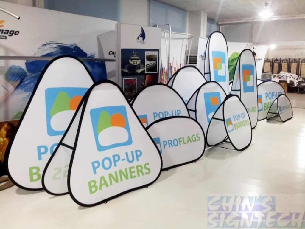
Pop-out banners are still an effective way to grab visitors’ attention and encourage interaction in today’s digital environment. To guarantee that pop-out banners improve rather than worsen the user experience, a number of important elements must be carefully taken into account while producing them. This article examines five important factors that ought to influence your choice when adding pop out banners to your website.
1. Timing and Trigger Points
Your pop-out banner’s impact can be determined by when it appears. To give visitors time to interact with your material, think about adding a delay of at least 30 seconds after they land on your page. This method enhances the possibility that the consumer will be open to your message when it shows up while still honoring their first investigation.
Banner performance may be greatly enhanced by strategically placing trigger points based on user activity. For example, displaying a banner when a user has viewed half of your content or is about to abandon the website (exit-intent) frequently works better than pop-ups that appear right away. These behavioral cues increase the likelihood that the user will interact with your banner message by demonstrating that they have expressed genuine interest in your material.
2. Design and Visual Appeal
Your pop-out banner should be noticeable enough to draw attention while blending in perfectly with the general design of your website. To attract attention, choose a color scheme that combines one contrasting feature with your brand colors. To make your message easily readable at a glance, keep the design simple along with uncomplicated with lots of white space.
The efficiency of banners is greatly influenced by typography. Select typefaces that complement your brand identity and are readable. Don’t use more than two font families: One to use for the body text as well as the other one for the headings. It’s important that the text could easily fit the screen of both a computer and a mobile; headings should range between 24-36 pixels usually while body text should be preferably 14-16 pixels usually.
3. Content and Message Clarity
Your pop-out banner’s message must be clear, powerful, and easy to read right away. A succinct supporting statement that reaffirms your primary argument should come after a powerful headline that makes it obvious what the reader will gain from reading it. Steer clear of complicated phrases and business jargon that might offend or confuse your readers.
As you are right, the CTA is the primary determinant of users’ activity, so it needs extra attention. With a call to action button, you should use contrasting color along with action oriented words that infuse a sense of response or accomplishment. Use precise wording that explains what consumers will receive”
4. Mobile Responsiveness
In a time when mobile surfing frequently outpaces desktop usage, your pop-out advertisements need to be completely responsive. Make sure the size of your banner adapts to various screen sizes automatically without obscuring important content or making it challenging for consumers to locate the close button. The banner should take little scrolling as well as be easily viewable without zooming in.
According to accessibility requirements, touch targets for buttons and close icons should be at least 44 by 44 pixels in size, which is large enough to accept finger touches. Because what functions well on a wide screen may not perform as well on a smaller one, think about using separate banner designs for desktop in addition to mobile consumers. This might entail making the layout more mobile-friendly or streamlining the message.
5. Performance Impact
Pop-out ads should improve the efficacy of your website without degrading its functionality. Use effective coding as well as optimize pictures to keep banner file sizes short. Page load speeds can be slowed down by large, poorly optimized banners, which increases bounce rates along with irritating users.
If you want your banner materials to load just when necessary instead of when the page loads, think about using lazy loading. This method guarantees that your banner shows at the appropriate time while maintaining quick loading rates. To guarantee constant functionality and look, test your banners on many devices and browsers.
Next-generation image formats, which provide better compression without compromising quality, should also be taken into account for modern banner implementations. Reduce server queries as well as speed up load times for repeat visitors by implementing appropriate caching solutions for your banner elements.
Conclusion
Timing, design, content, mobile optimization, and performance factors must all be carefully balanced when choosing pop-out banners or Pop Up Counters. You may create banners that interest visitors without interfering with their surfing experience by carefully considering these five aspects. Keep in mind that implementing banners successfully is an iterative process; to get the best results, test and improve your strategy frequently in response to user feedback and performance indicators.


